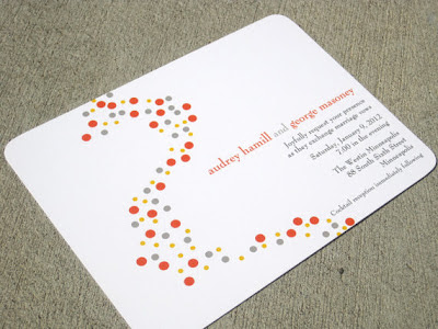
So, I started scouring the interwebs for inspiration. There were a bunch of invitations I loved (and still pine for), but I tried to stay focused on ones with simple formats and straightforward text.
I love this one because it's simple and beautiful. But, would that simplicity stand up as well without the embellishments of the flowers and monogram? I wasn't 100% sure.
Banner and Branches by Alethea and Ruth via Minted
The next one is even simpler; I like the clean and modern look of this one (a lot). I think that this would translate pretty well without the circles. But, our text needs to fit in a pretty small area and I still didn't think this was IT.
Modern Circles by Stelie Designs via etsy
Finally, I found one on weddingbee that I thought would work perfectly.
DIY Invite by Capricorn79 via weddingbee
I found a few fonts I liked on dafont and got to work. I moved the names over to the left more and tried to make the overall shape more of a square... And, very quickly, my work on this invitation was stopped. Why? Because after about one half second of looking at it, the FI told me he hated it.
Seriously, my FI has some surprisingly strong opinions on fonts and formatting. While I'm drawn to the idea of our names in curly script, he would prefer something a little plainer. I believe his requirement was something like "no flourish should complete more than 30 degrees of a curl on itself"... What does that even mean? Engineers!?!
Additionally, the angled writing bothered him. He would prefer it to be flat, straight across the page, all orderly like.
So, another inspiration needed to be found.
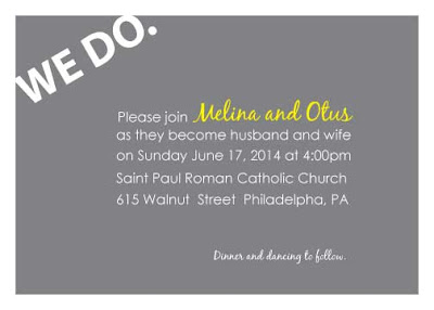
DIY Invite by theoddbride via weddingbee
Excluding the WE DO in the corner, this was exactly what I'd been looking for. It really doesn't get much simpler than that. I like the informal feel that comes from the first names and numbers in number form (instead of spelled out).
Another mock up later and I tried it out (pasted it on a picture of my invite prototype). I'm pretty pleased with the results... There will definitely be some tweaks, but it's a start.
Personal Picture
Most of the lines will end up about even with the end of the word "wife". So, it looks almost centered with our actual information on it. The fonts are Geosans Light and Honey Script Light (FI approved BTW).
Now I still need to decide on color of ink. Should it be black? Or, blue to match the paper? Should our names be different than the body like in the inspiration? Plus, I'll need to make few samples and probably let the FI make any fine tunings that only he would notice.
Did you design your invitations? Or, did you find something you loved on one of the invitation websites? Or, did you go old school and visit a paper store in person? (Do people still do that? They must because the stores still exist.)


No comments:
Post a Comment